VALENTINE'S CAMPAIGN
CONCEPT | UX
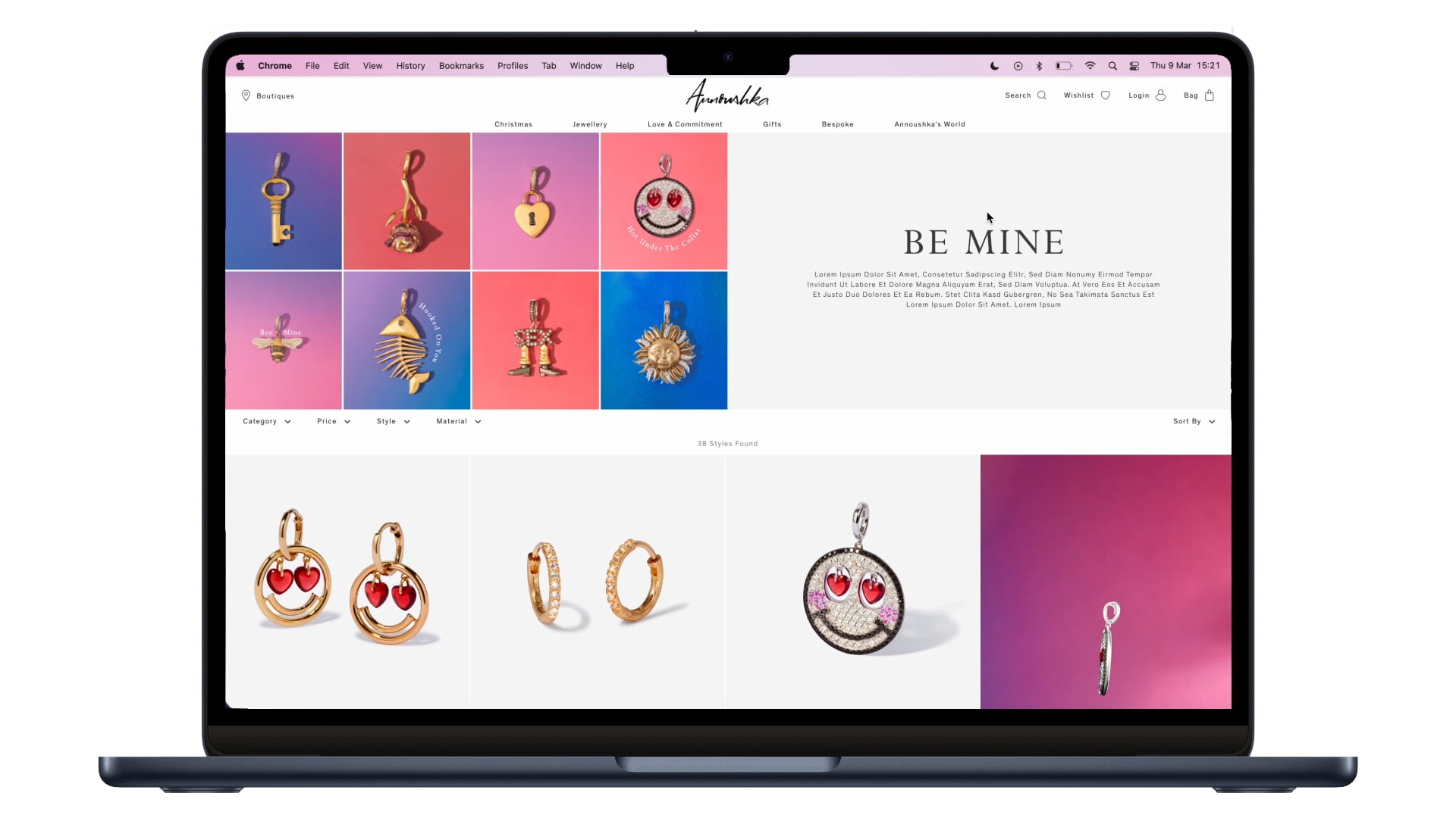
For our Valentine's experience, I wanted to ensure our visuals were considered and engaging. We have seen a high click rate across our merch slots, particularly on video. With this in mind, I prioritized the 3D charm animation, followed by a showstopping image of the best-selling Marguerite diamond necklace. When selected merch slots flow to the relevant PDP.
The PLP banner image has seen over 5% click rate, therefore I ensured all products
featured in grid elements are hotspots that flow to the relevant PDP. Every touchpoint is a shoppable opportunity.
HOW TO SPEND IT | FINANCIAL TIMES
COUNTRY & TOWN HOUSE
The charms grid creative was used for consistency and impact in our print advertisements and proved highly engaging, with customers coming into the store with the page folded in their pockets! We saw high QR code scans at 50 (our average around 10-15 scans)
The beauty of the grid concept enables the brand to have agility in their comms, tweaking the edits based on relevant targeting


HARRODS
POP UP
DIGI SCREENS
A key pillar of the brand, charms are integral to the Annoushka. The pop-up and digital screens in Harrods presented an opportunity to increase brand awareness amongst potential customers.
I developed the charms grid concept specifically with versatility and scalability in mind. In the Harrods pop up the colour and quantity of charms prove impactful and playful. Stopping passers-by in their tracks to take a closer look.